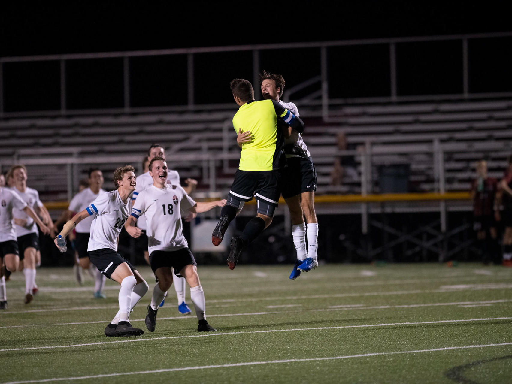
This challenge sought to have a brand's identity be designed from scratch, just using a prompt giving a cursory background of the goal of this new company, their name and core values. Beyond the aforementioned brief, the project was mostly free reign on design concepts.
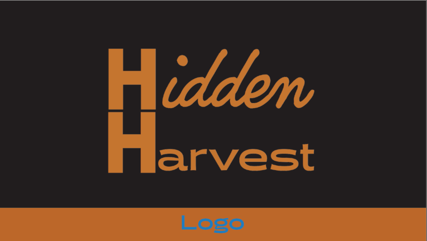
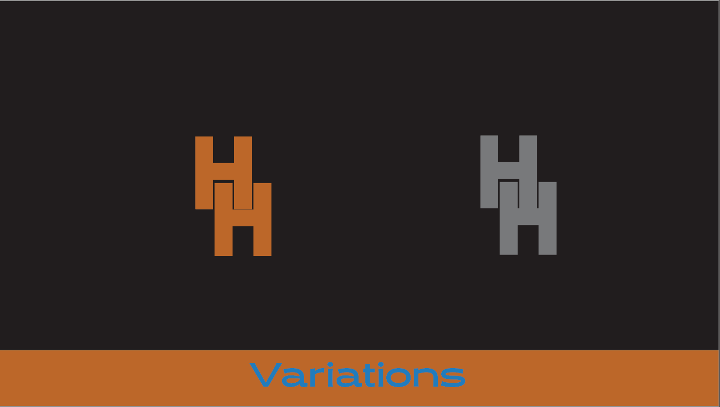
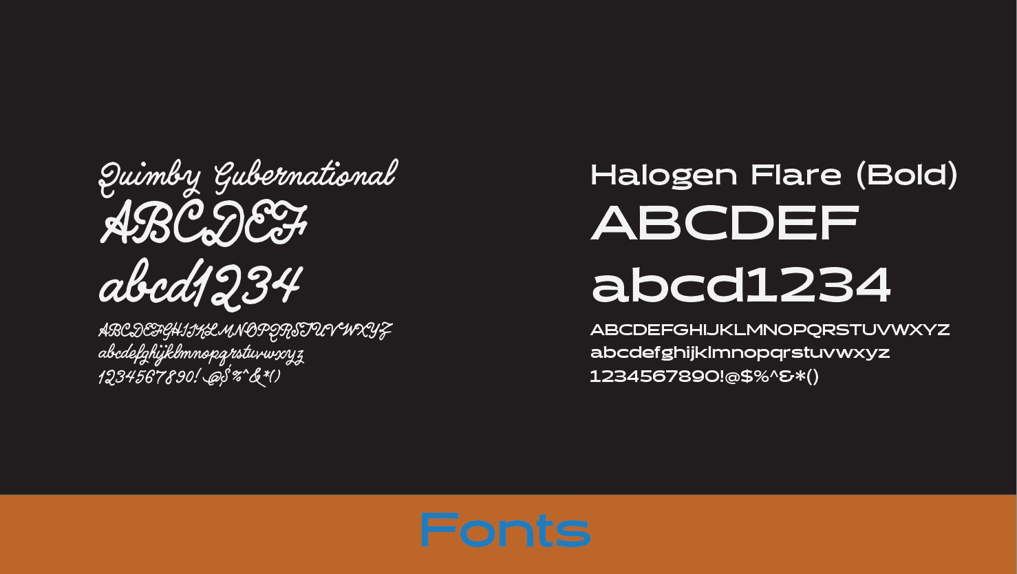
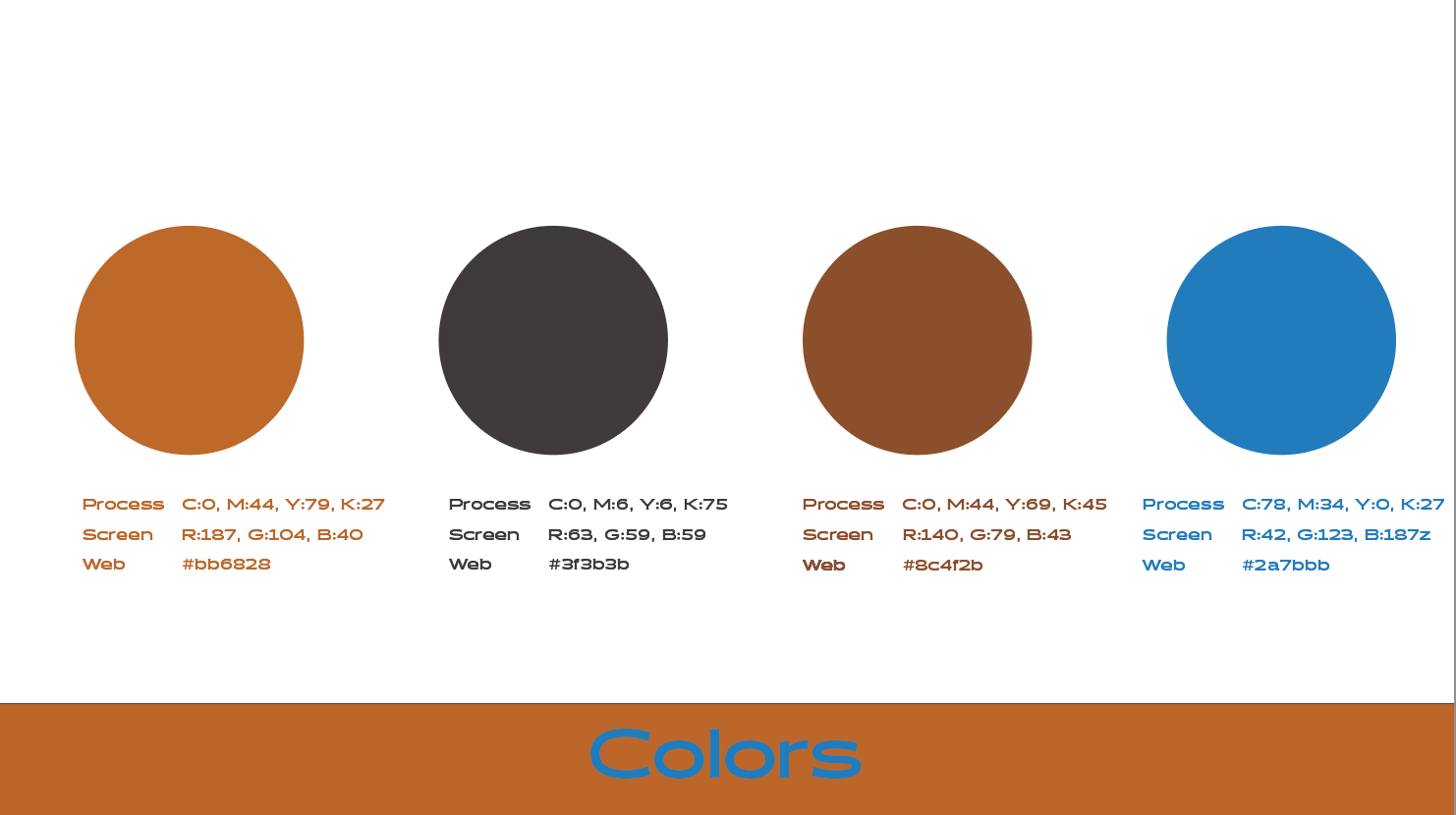
To start tackling this challenge, I initially had a thought to try and incorporate the name of the brand within a tree line but was unable to create a satisfactory design with that self-imposed constraint. After sketching out a variety of other ideas, the first used design for Hidden Harvest's logo incorporated a house alongside the text, built out of the basis of the letter H as a way to draw a connection with the brand and home cooking, since the ingredients are shipped directly to the customer. However, when transiting that logo into the motion component, I ran into issues trying to incorporate the H building out to become a house in a satisfactory manor, leading to the final design shown below. This design uses a mix of iconography with the two H letters being pulled from the interlocking variant logo, showcasing cohesion between logos and a contrast in fonts with "idden" being in cursive to try and loosely make it appear elusive, since the ingredients used in the company are from overstock, among other sources. Furthermore, "harvest" is in a more uniform font to showcase that even if the ingredients are from a non-traditional source, they are high quality and able to be used for cooking in any regard. The colors chosen are meant to showcase a more earthy-esque visual design with oranges and browns with a black secondary to make the brighter colors pop.

Alongside coming up with the Brand Identity for the fictional "Hidden Harvest" brand, another challenge that followed was taking the logo that was designed and creating a Brand Manifesto video. An additional component was to add motion to the logo.
To achieve these new requirements, I pulled footage of a variety of ingredients as it is integral to the foundational aspects of Hidden Harvest and combined it with showcasing a variety of different people coming together to interact with each other during cooking to showcase the potential that Hidden Harvest has to bring friends and family to communicate while cooking. For the motion of the graphic, I decided to strip down the base Hidden Harvest logo to the variant, with one H coming in from the top and bottom of the screen, respectively, having them interlock, unlock then proceed to their normal position for the company logo. Additionally, to play into the word "Hidden", I had "idden" fade in from behind the upper H and had "arvest" raise up from the bottom, as if it was a crop growing to potentially be packaged for a Hidden Harvest box.
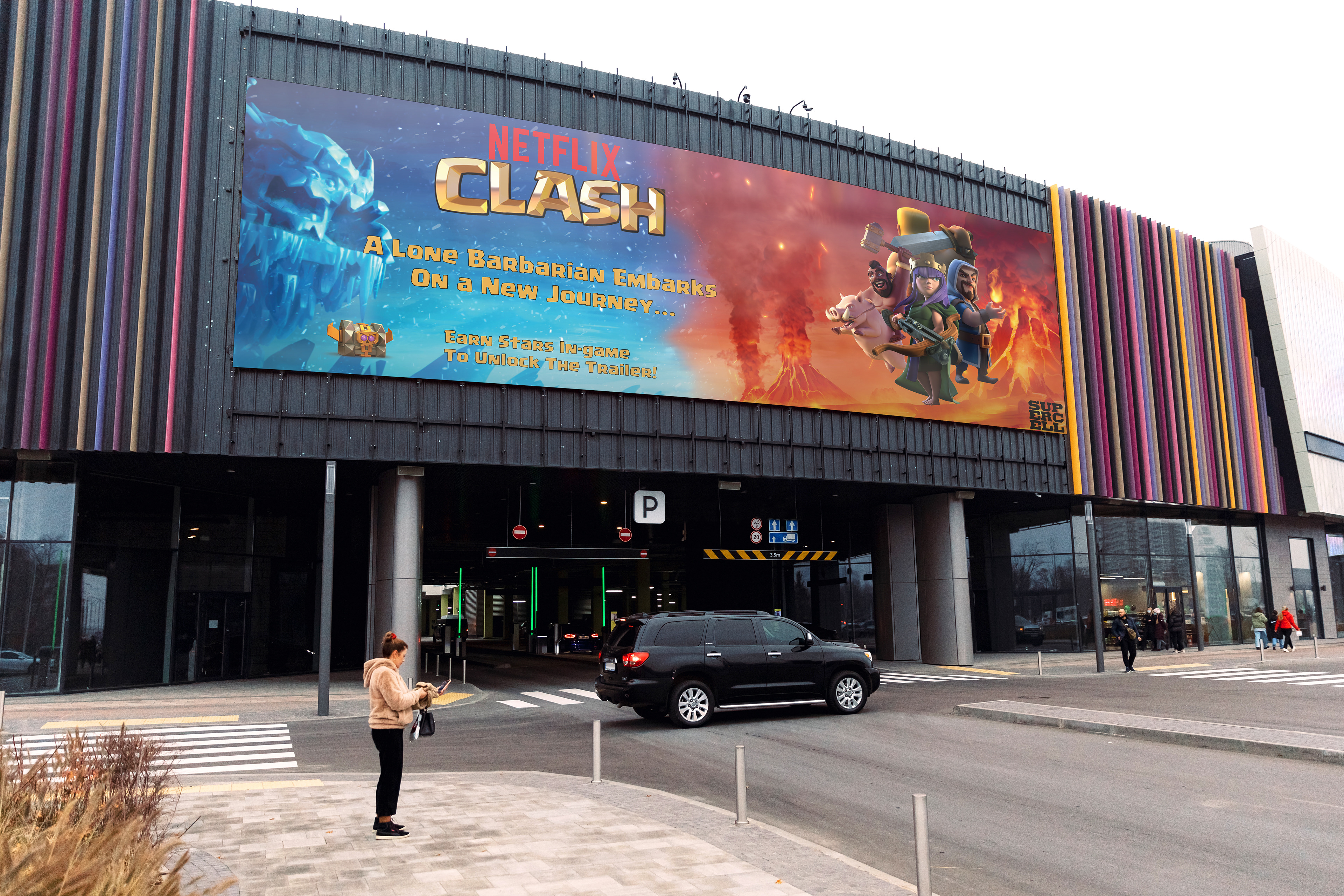
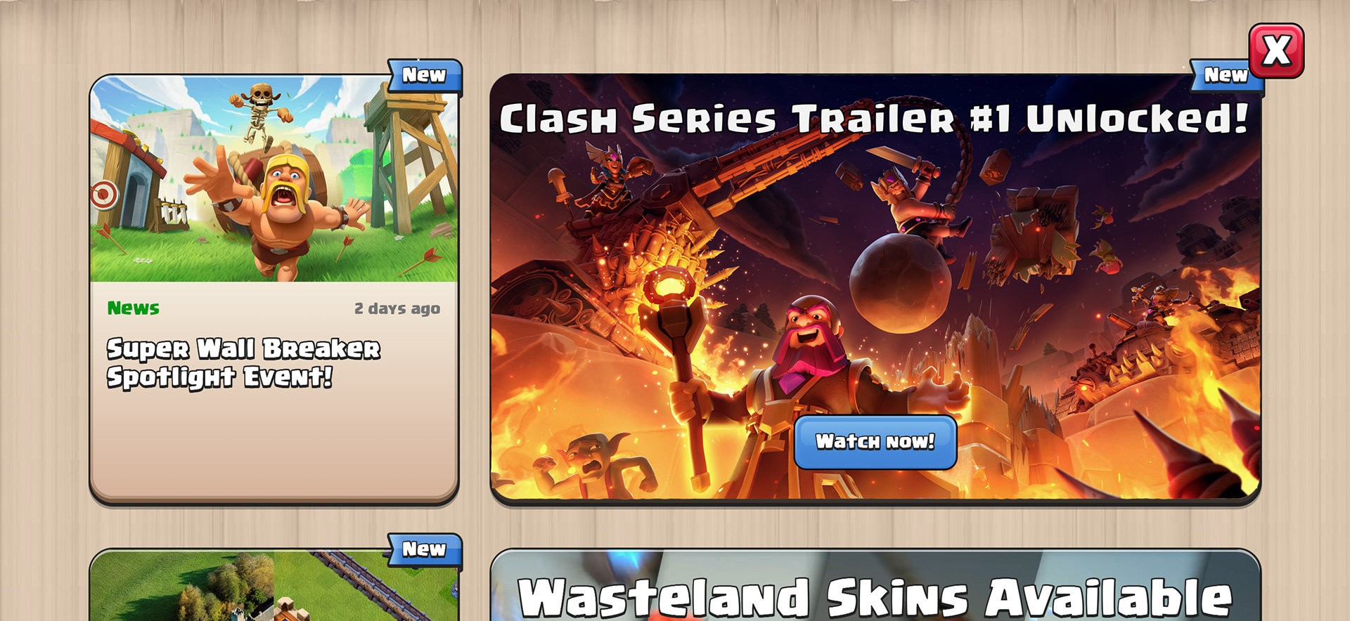
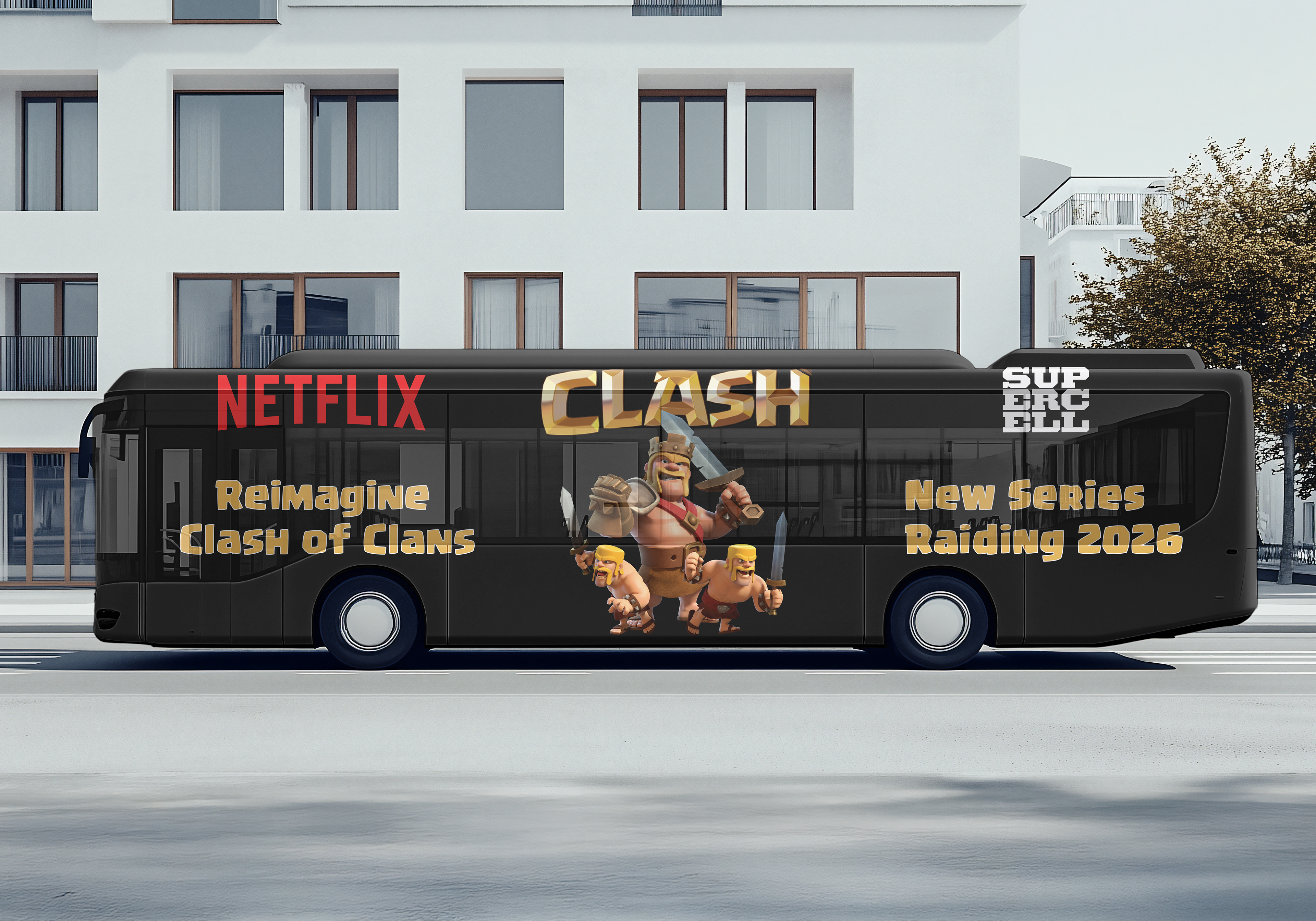
The final challenge proposed in the class was to design a campaign around garnering interest again with the Clash of Clans IP. A new Netflix series was announced in early 2025 that was the catalyst for being a client given. While the initial project was a group endeavor, the following were modified myself to adapt for an alternative take on the campaign.
While the layouts and copy for all the executions below were of my own doing, the location and basic concepts were created by the group, then left to me to expand upon. I took majority inspiration from Netflix's prior campaigns on billboards and buses, most notably from Arcane and House of Cards respectively along with the in-game news feed mock-up. Most assets on the executions come directly from Supercell's website that houses renders from Clash of Clans.